TVO Media Education Group
TVO Media Education Group
TVO Media Education Group
Cutting donation form build time by 90%
Cutting donation form build time by 90%
A flexible form and campaign system that let TVO's philanthropy team launch new donation campaigns in a few clicks.

The Task: Create a modernized digital donation strategy and payment portal
The Client: TVO
My Role: UX Designer and Researcher
Skills involved: user research, usability testing, affinity diagram, customer journey mapping, interaction design, prototyping, wireframing
Tools: Figma, Adobe Suite (XD), Miro
Timeline: 4 months
Forms that broke for donors and slowed down the team
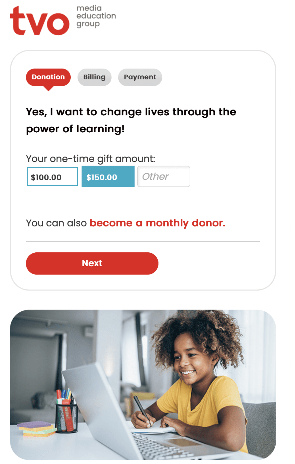
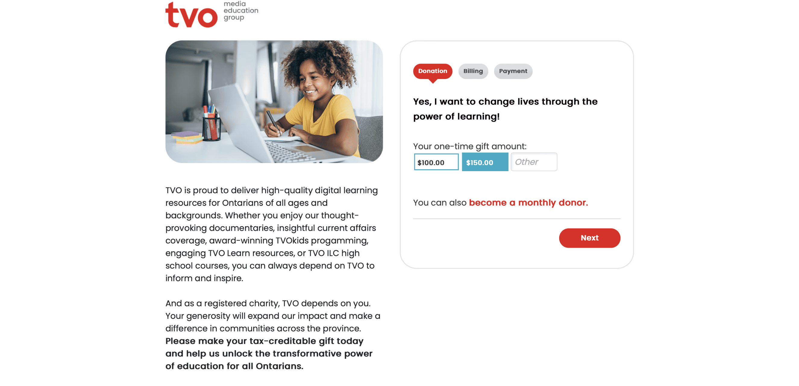
TVO's donation forms were generic and cluttered, and they often broke on phones and tablets. Behind the scenes, naming conventions and styles lived in several places, so every new campaign meant manual work for the philanthropy team. The problem wasn't one form. It was the system that produced them.
Forms that broke for donors and slowed down the team
TVO's donation forms were generic and cluttered, and they often broke on phones and tablets. Behind the scenes, naming conventions and styles lived in several places, so every new campaign meant manual work for the philanthropy team. The problem wasn't one form. It was the system that produced them.
Forms that broke for donors and slowed down the team
TVO's donation forms were generic and cluttered, and they often broke on phones and tablets. Behind the scenes, naming conventions and styles lived in several places, so every new campaign meant manual work for the philanthropy team. The problem wasn't one form. It was the system that produced them.
Yes, I want to support indepth
journalism & documentaries
$30
$25
$20
Custom
$15
$10
$5
Donate
Monthly
Annually
One-Time
Donate Now
Donate
One system instead of scattered forms
Before, brand, design, logic and HTML lived in separate places, and editors pasted code between them. I moved styling and logic into the form settings themselves, so each form carries its own look and behaviour. Editors could now create or update a form in a few clicks, without breaking the page.
Donors wanted to know where their money goes
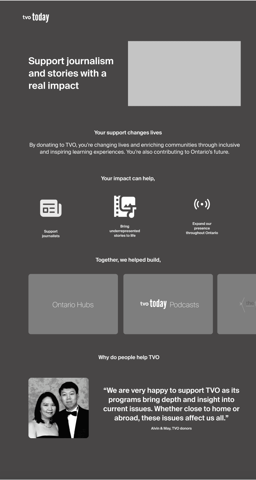
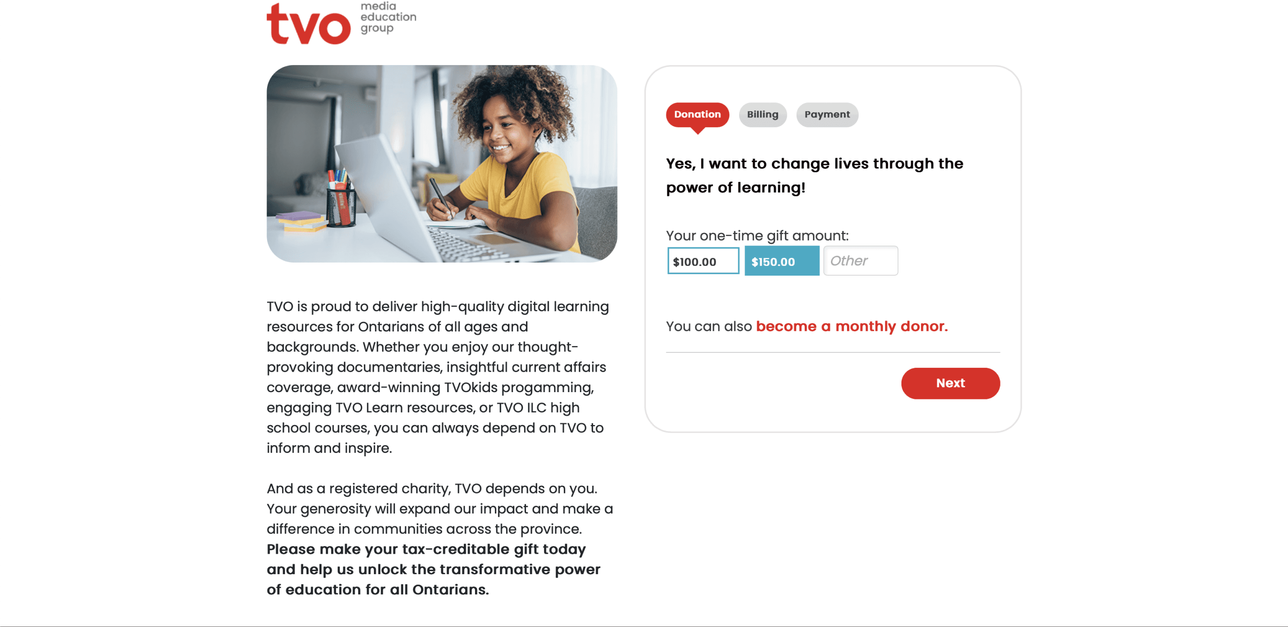
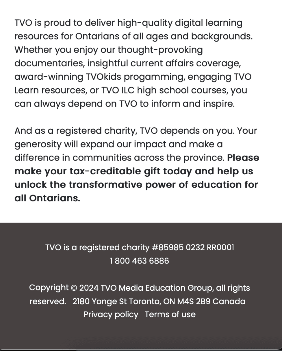
In research with donors, transparency came up again and again. People wanted to see how their contribution would be used, but TVO had no dedicated campaign pages to show them. I made the case for campaign landing pages that connect each ask to a clear outcome.

Donors wanted to know where their money goes
In research with donors, transparency came up again and again. People wanted to see how their contribution would be used, but TVO had no dedicated campaign pages to show them. I made the case for campaign landing pages that connect each ask to a clear outcome.
HTML
Design
Brand
Logic
HTML
Before
Form
Form
Design
Logic
Brand
After
HTML
Form
Design
Logic
Brand
less time to design and build a new donation form
90%
Raised by the TVO Telethon, powered by the system after I left
$150,000
Used what the platform already had
The obvious fix was a new custom form build. Instead, I dug into the existing donation platform and found settings and features the team wasn't using, including security categories. Rebuilding the workflow around those gave editors control in a few clicks, without new development.
One system instead of scattered forms
Widgets that ask at the right moment
Before, brand, design, logic and HTML lived in separate places, and editors pasted code between them. I moved styling and logic into the form settings themselves, so each form carries its own look and behaviour. Editors could now create or update a form in a few clicks, without breaking the page.
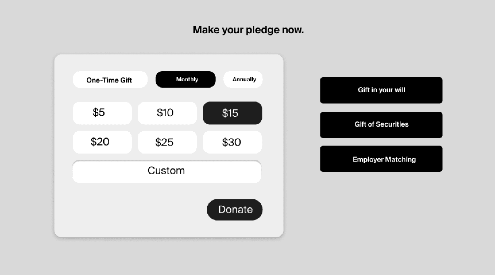
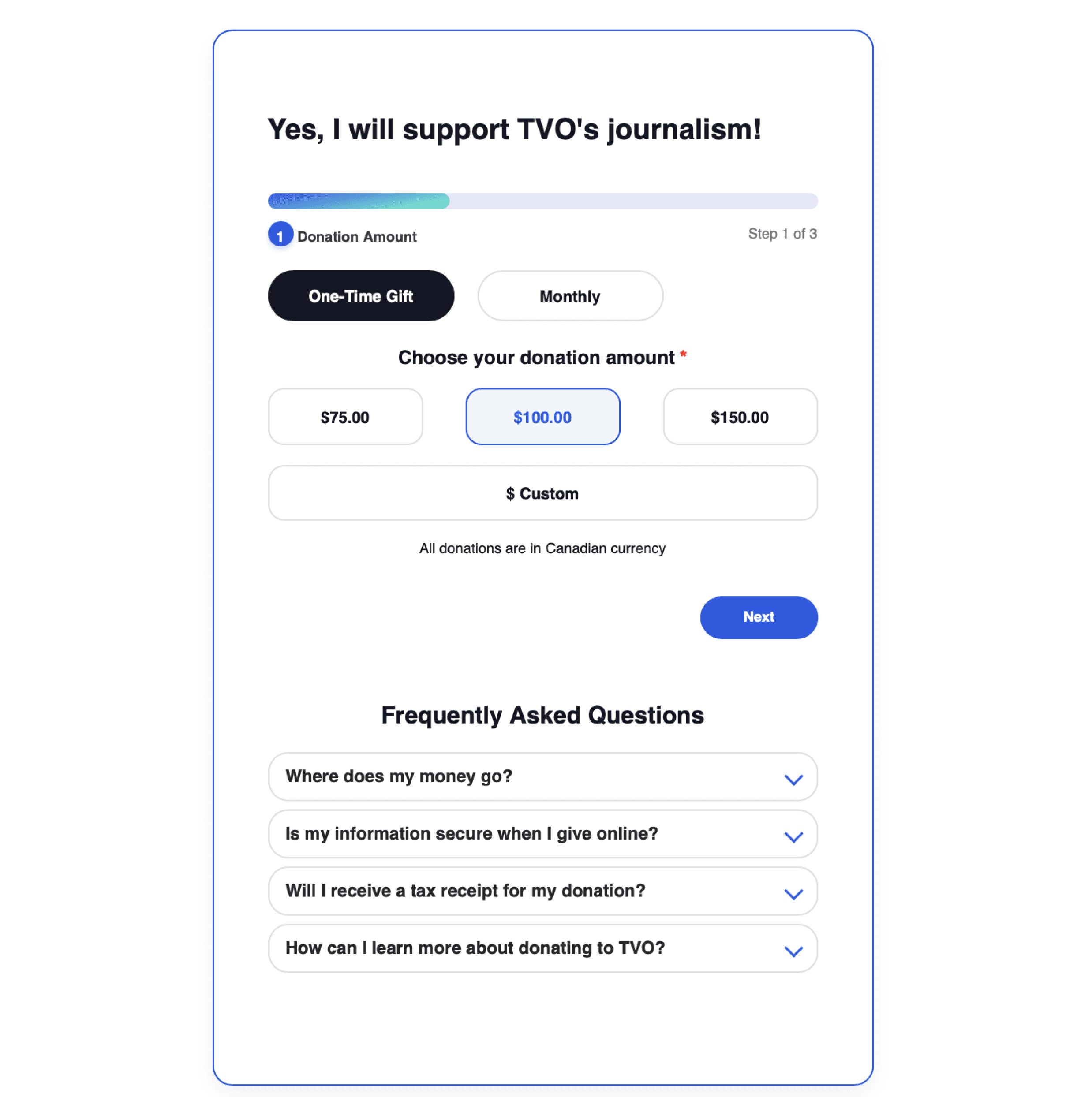
A form alone waits for people to find it. I designed initial prototypes donation widgets that sit inside articles and campaign pages, with the idea that readers can give while they're learning about the work. They stay subtle, with no heavy animation, and guide people from interest to donation.
Donors wanted to know where their money goes
In research with donors, transparency came up again and again. People wanted to see how their contribution would be used, but TVO had no dedicated campaign pages to show them. I made the case for campaign landing pages that connect each ask to a clear outcome.
HTML
HTML
Before
After
Form
Form
Design
Design
Logic
Logic
Brand
Brand
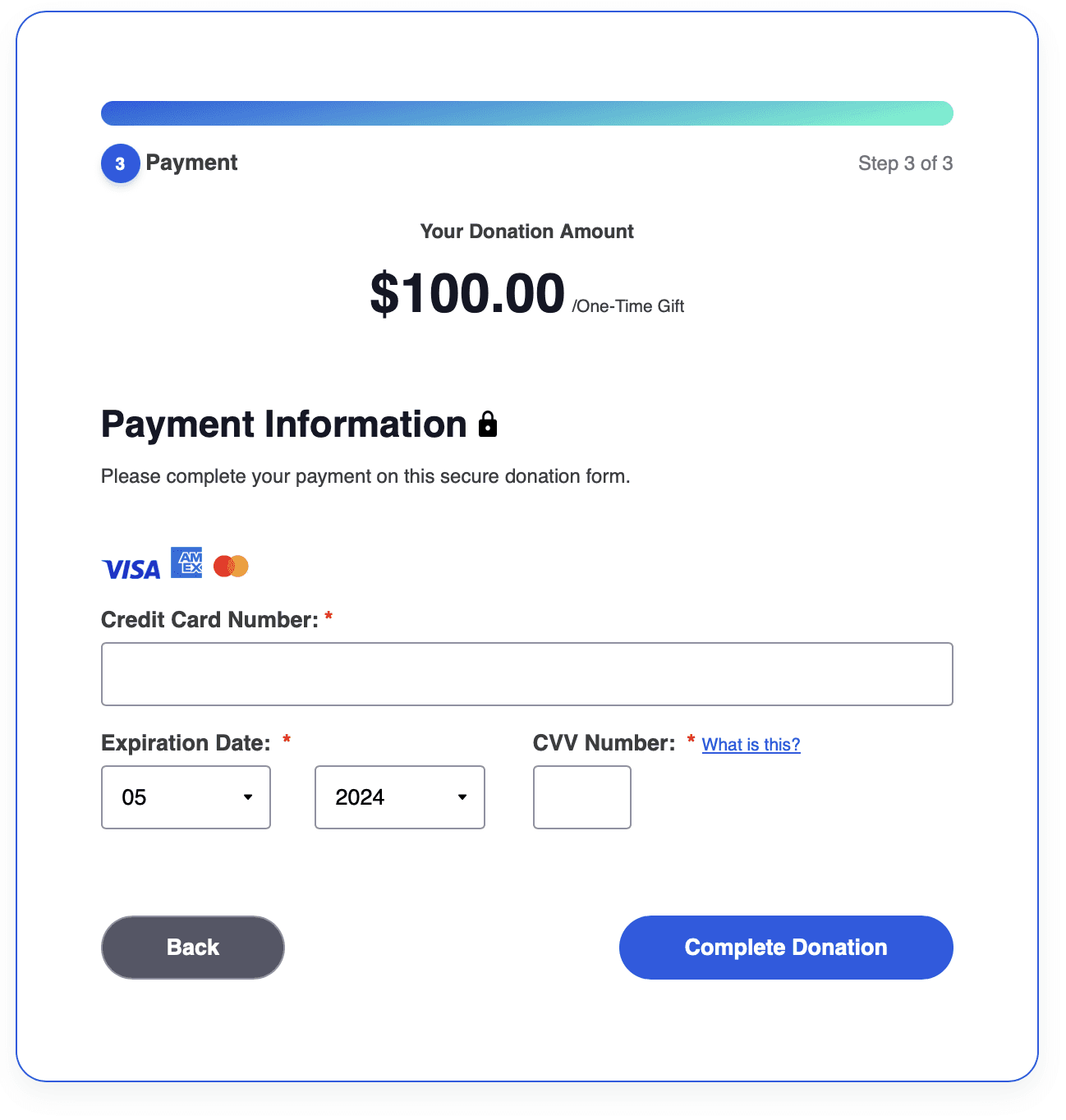
Forms are fluid, easy to understand, accessible and reduce information overload
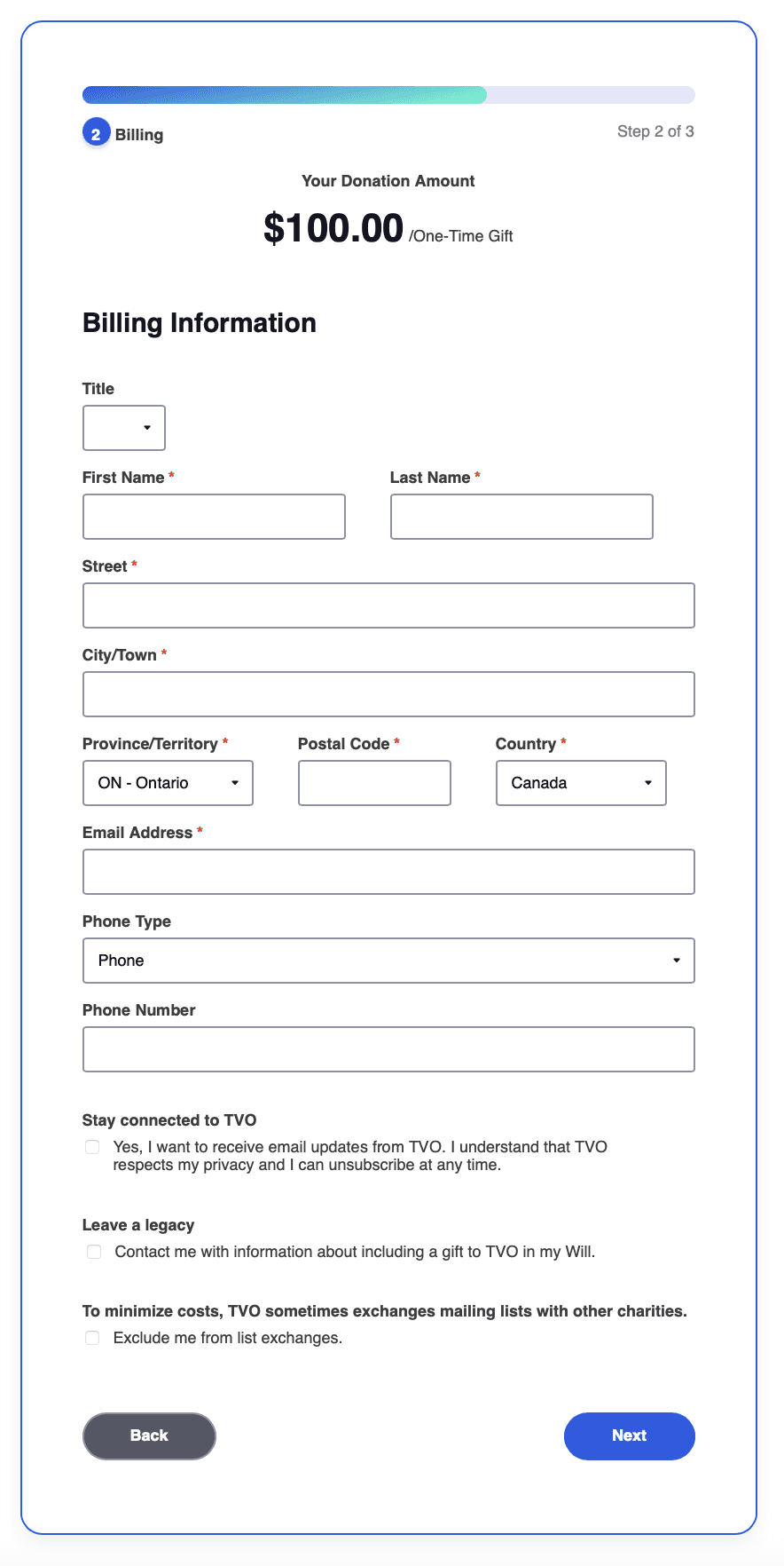
With consistent styles stored in the form settings rather than a page wrapper, forms adapt across screen sizes and no longer break when editors copy and paste code.
Forms are fluid, easy to understand, accessible and reduce information overload
With a consistant system in place, the styling could now be easily changed since many of these assets are within
the form settings themselves and not a page wrapper. This means styles are less prone to html/css breakage from editors copying and pasting code.
Widgets that ask at the right moment
A form alone waits for people to find it. I designed initial prototypes donation widgets that sit inside articles and campaign pages, with the idea that readers can give while they're learning about the work. They stay subtle, with no heavy animation, and guide people from interest to donation.
Donate Now
Donate
Yes, I want to support indepth journalism & documentaries
Monthly
Annually
One-Time
$30
$25
$20
Custom
$15
$10
$5
Donate
Forms are fluid, easy to understand, accessible and reduce information overload
With a consistant system in place, the styling could now be easily changed since many of these assets are within
the form settings themselves and not a page wrapper. This means styles are less prone to html/css breakage from editors copying and pasting code.
Want to learn more?
Lets talk
One system instead of scattered forms
Before, brand, design, logic and HTML lived in separate places, and editors pasted code between them. I moved styling and logic into the form settings themselves, so each form carries its own look and behaviour. Editors could now create or update a form in a few clicks, without breaking the page.
Results
less time to design and build a new donation form
90%
raised by the TVO Telethon, powered by the system after I left
Raised by the TVO Telethon, powered by the system after I left
$150,000
HTML
Design
Brand
Logic
HTML
Before
Form
Form
Design
Logic
Brand
After
HTML
Form
Design
Logic
Brand
Used what the platform already had
The obvious fix was a new custom form build. Instead, I dug into the existing donation platform and found settings and features the team wasn't using, including security categories. Rebuilding the workflow around those gave editors control in a few clicks, without new development.
Widgets that ask at the right moment
A form alone waits for people to find it. I designed initial prototypes donation widgets that sit inside articles and campaign pages, with the idea that readers can give while they're learning about the work. They stay subtle, with no heavy animation, and guide people from interest to donation.
The redesign changed how TVO builds and manages donation forms. Editors could launch targeted, on-brand campaigns without developer help, and forms stopped breaking across devices.
Donate Now
Donate
Yes, I want to support indepth journalism & documentaries
Monthly
Annually
One-Time
$30
$25
$20
Custom
$15
$10
$5
Donate
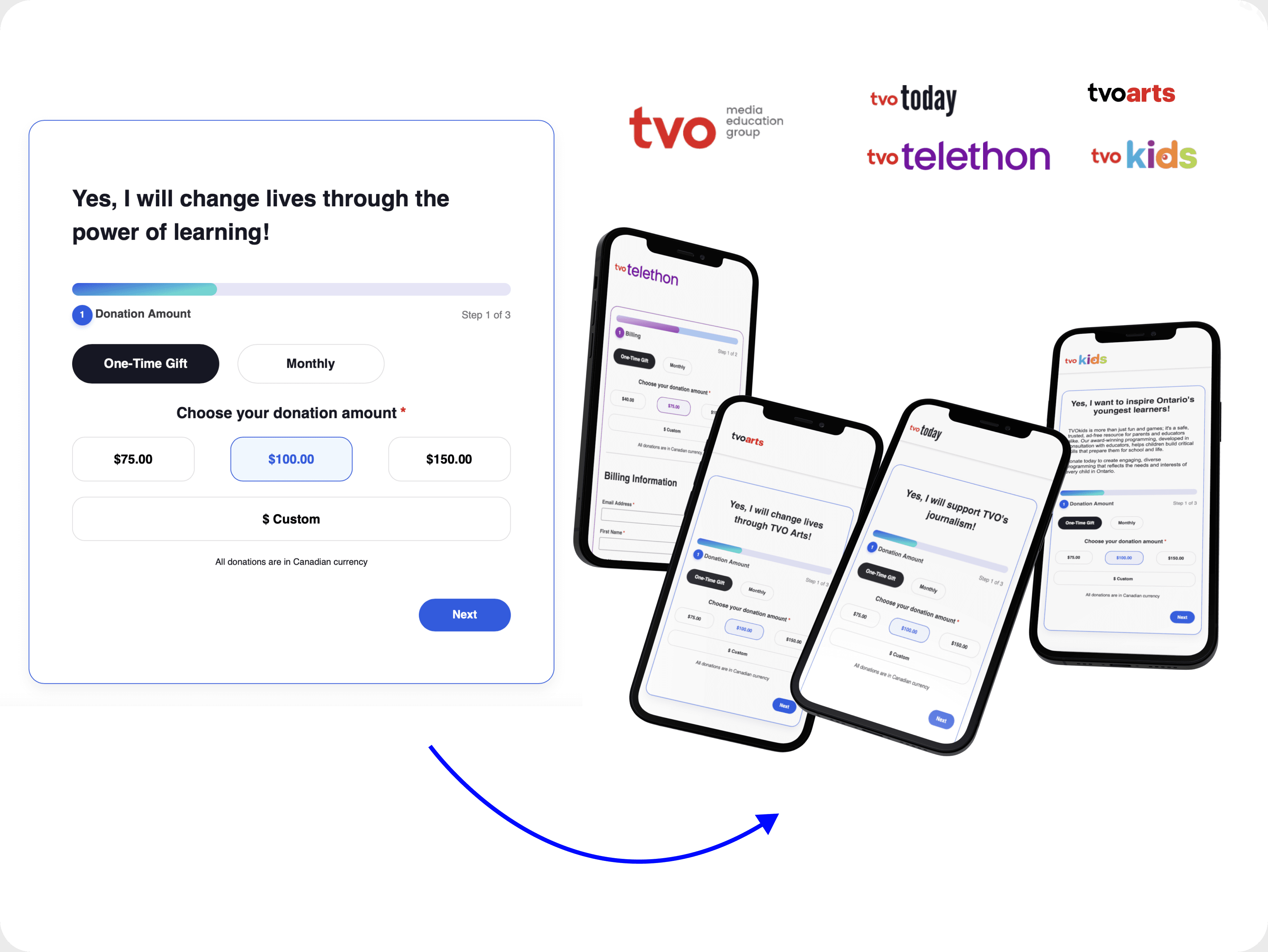
Forms that broke for donors and slowed down the team
TVO's donation forms were generic and cluttered, and they often broke on phones and tablets. Behind the scenes, naming conventions and styles lived in several places, so every new campaign meant manual work for the philanthropy team. The problem wasn't one form. It was the system that produced them.
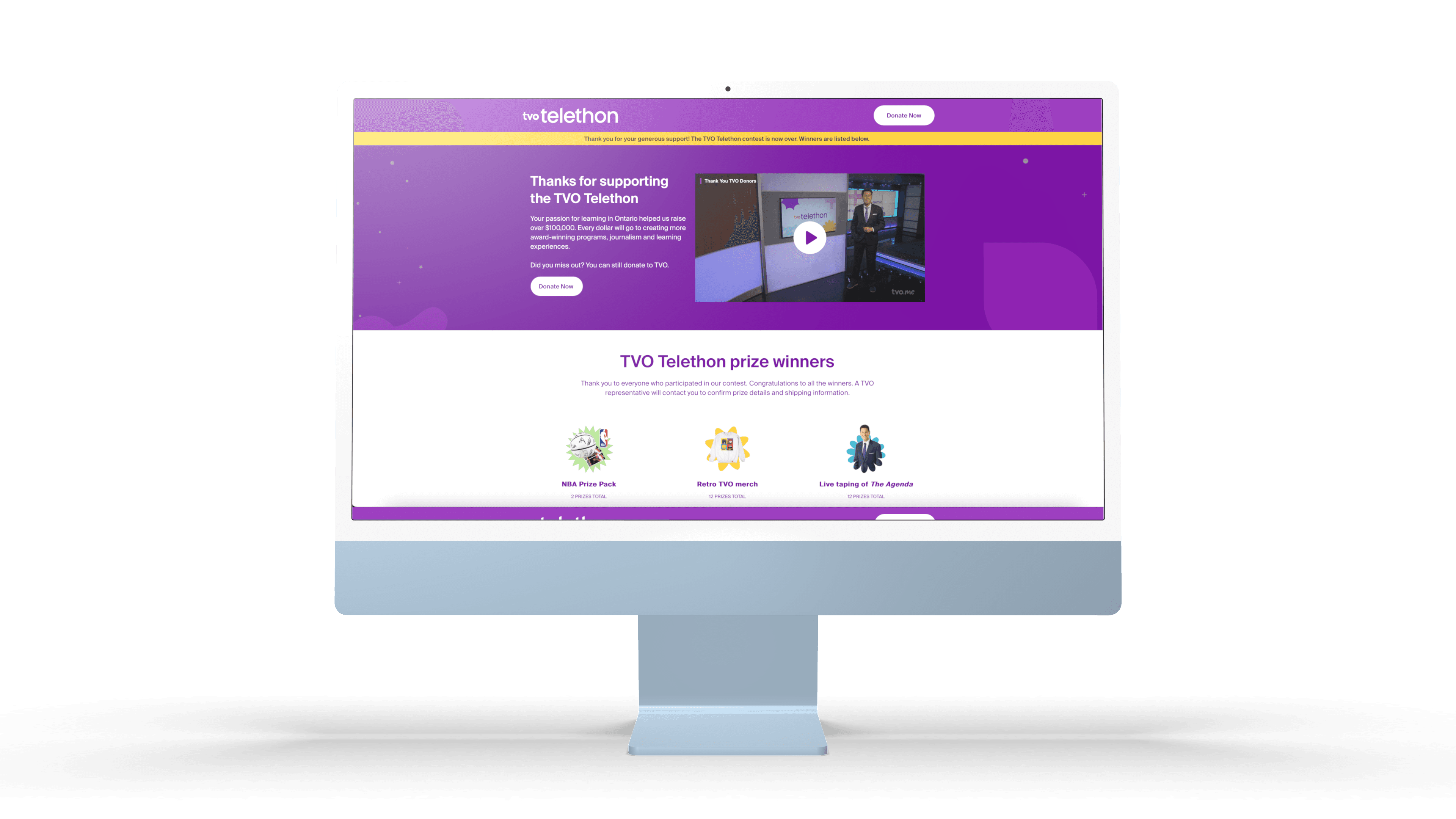
After I left, TVO launched the landing pages I'd advocated for, including the Telethon campaign.
It drove people from TV, social and QR codes to one page, where the widgets and redesigned forms made giving quick.
The campaign raised $150,000 in new donations.
Used what the platform already had
The obvious fix was a new custom form build. Instead, I dug into the existing donation platform and found settings and features the team wasn't using, including security categories. Rebuilding the workflow around those gave editors control in a few clicks, without new development.
Donors wanted to know where their money goes
In research with donors, transparency came up again and again. People wanted to see how their contribution would be used, but TVO had no dedicated campaign pages to show them. I made the case for campaign landing pages that connect each ask to a clear outcome.
Used what the platform already had
The obvious fix was a new custom form build. Instead, I dug into the existing donation platform and found settings and features the team wasn't using, including security categories. Rebuilding the workflow around those gave editors control in a few clicks, without new development.
One system instead of scattered forms
Before, brand, design, logic and HTML lived in separate places, and editors pasted code between them. I moved styling and logic into the form settings themselves, so each form carries its own look and behaviour. Editors could now create or update a form in a few clicks, without breaking the page.
Want to learn more? Lets talk
Results
Widgets that ask at the right moment
A form alone waits for people to find it. I designed initial prototypes donation widgets that sit inside articles and campaign pages, with the idea that readers can give while they're learning about the work. They stay subtle, with no heavy animation, and guide people from interest to donation.
Donate Now
Donate
Yes, I want to support indepth journalism & documentaries
Monthly
Annually
One-Time
$30
$25
$20
Custom
$15
$10
$5
Donate
HTML
HTML
Before
After
Form
Form
Design
Design
Logic
Logic
Brand
Brand
The redesign changed how TVO builds and manages donation forms. Editors could launch targeted, on-brand campaigns without developer help, and forms stopped breaking across devices.
Forms are fluid, easy to understand, accessible and reduce information overload
With a consistant system in place, the styling could now be easily changed since many of these assets are within
the form settings themselves and not a page wrapper. This means styles are less prone to html/css breakage from editors copying and pasting code.
Results
this value proposition needed to be reflected in their digital platforms to incentivize
users to donate beyond a message but experienced in the platforms and interfaces
we host.
Since 2017, there has been a pressing need to enhance our digital offerings to attract young, informed millennials. The onset of COVID-19 intensified this urgency. Additionally, we aimed to engage marginalized groups and share more stories from an Ontario perspective to drive our success.
this value proposition needed to be reflected in their digital platforms to incentivize
users to donate beyond a message but experienced in the platforms and interfaces
we host.
Since 2017, there has been a pressing need to enhance our digital offerings to attract young, informed millennials. The onset of COVID-19 intensified this urgency. Additionally, we aimed to engage marginalized groups and share more stories from an Ontario perspective to drive our success.
Want to learn more? Lets talk
After I left, TVO launched the landing pages I'd advocated for, including the Telethon campaign.
It drove people from TV, social and QR codes to one page, where the widgets and redesigned forms made giving quick.
The campaign raised $150,000 in new donations.
The redesign changed how TVO builds and manages donation forms. Editors could launch targeted, on-brand campaigns without developer help, and forms stopped breaking across devices.
Results
After I left, TVO launched the landing pages I'd advocated for, including the Telethon campaign.
It drove people from TV, social and QR codes to one page, where the widgets and redesigned forms made giving quick.
The campaign raised $150,000 in new donations.